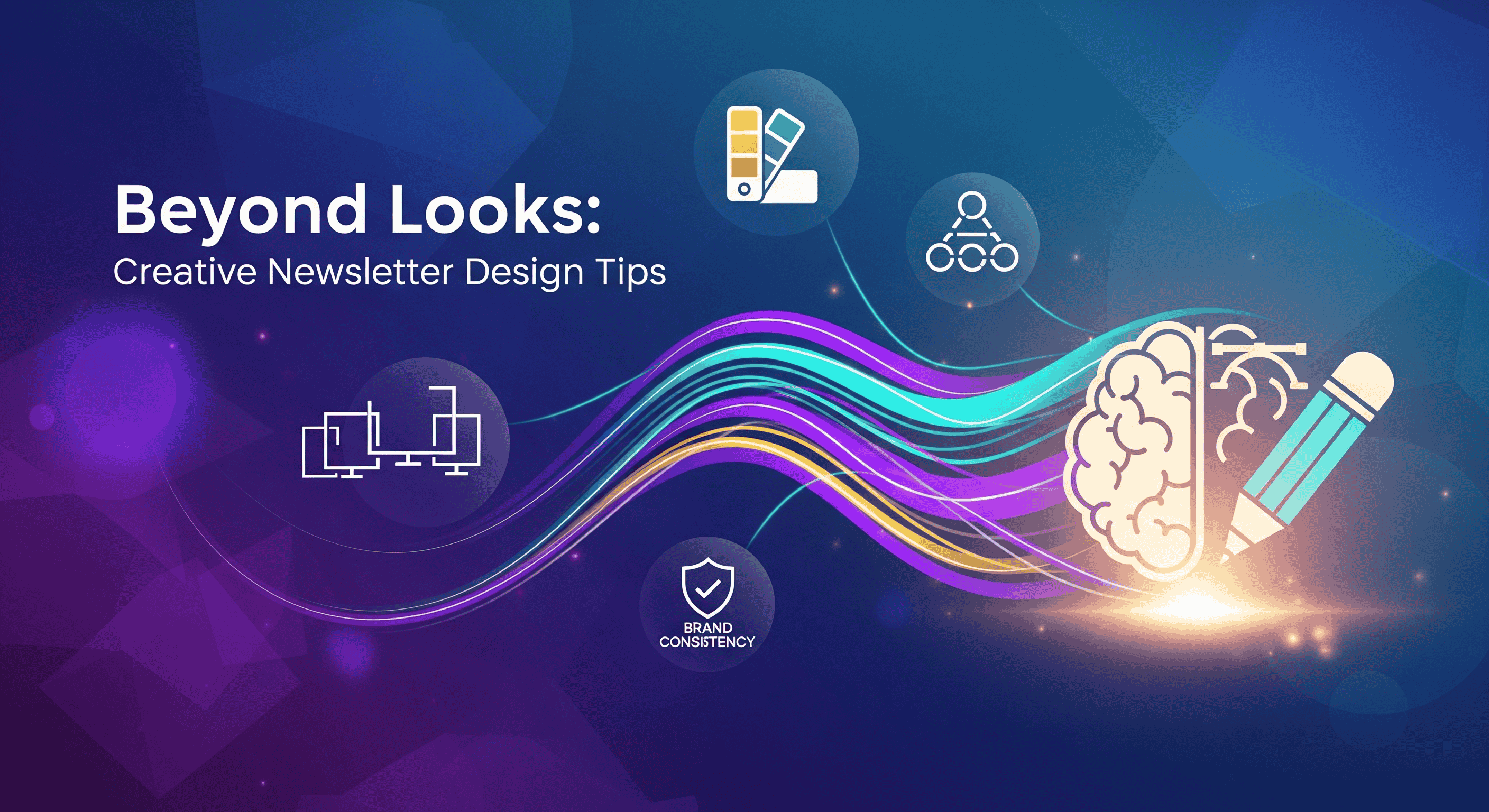
Beyond Looks: Creative Newsletter Design Tips
Go beyond pretty pictures. Learn creative newsletter design tips, from responsive layouts to visual storytelling, that boost engagement and get results.
Have you ever opened an email that looked absolutely beautiful, with stunning pictures and fancy fonts, but then felt a bit... confused? Maybe you couldn't easily find what you were looking for, or it just felt too busy to read. It's like a gorgeous car that won't start – it looks great, but it doesn't work.
The problem is, simply "pretty" isn't enough. An email can look amazing, but if it's poorly designed, your message gets lost, and your efforts don't lead to results.
This guide goes beyond just looks. We'll show you how creative newsletter design is about making your emails super effective. It's about making your design work hard for your business.
New to newsletters? For a complete overview of strategy from start to finish, be sure to read our below blog first.
 Shubham Swami
In this guide, you'll discover:
- Why great design leads to more clicks and sales.
- Simple rules for making your designs clear and powerful.
- The secrets to a perfect responsive design that wows on every screen.
- Fun ways to use visuals for powerful storytelling.
- How AdsEra helps you create stunning, effective designs—no experience needed.
Why Design Matters (More Than Just "Looks")
When your newsletter lands in someone's inbox, its design is your silent salesperson, working hard before a single word is read.
A clean, organized, and inviting design instantly builds trust and makes people feel comfortable. A cluttered design can make them hit the delete button without a second thought. Good design also acts like a helpful map for your readers, leading their eyes smoothly from your headline to your main message and, finally, to your call to action.
Most importantly, your visuals communicate your brand's personality. Your choice of colors, fonts, and images all whisper clues about who you are, helping people instantly recognize your emails and building a stronger connection over time.
The ABCs of Creative Newsletter Design: Key Principles
Ready to make your newsletters look fantastic and work even harder? These simple, yet powerful, "ABCs" are the email newsletter design best practices that truly make a difference.
A. Clarity & Simplicity (Less is MORE!)
Imagine your email is a room. If it's full of too much furniture and clutter, it's stressful. Your email is the same.
- Avoid Clutter: Give your words and pictures room to breathe! Use plenty of empty space (white space) to make it feel calm and easy on the eyes.
- One Main Idea: Focus on one core message per section. Don't try to cram too many ideas into one spot.
- Easy-to-Read Fonts: Choose fonts that are simple and clear first. Your words are the treasures, so make them easy to find.
B. Visual Hierarchy (Guide Their Eyes to the Treasure!)
Think of your email like a treasure map. You want to guide the reader's eyes straight to the "X"—your most important message or button.
- Make Important Things POP: Use different font sizes, bold text, or contrasting colors to make your headlines and offers jump out.
- Position of Power: Place your most critical elements—like that "Shop Now" button—where they are easily seen first.
C. Consistency (Always Look Like YOU!)
Imagine your favorite superhero. They always wear the same costume, right? That's how people know it's them. Your brand needs the same consistency.
- Your Brand's Uniform: Always use the same colors, fonts, and logos that match your brand. This helps readers instantly recognize your email.
- Building Trust: When your emails always look familiar, it builds trust and comfort over time.
D. Color Psychology (What Colors Whisper to Your Brain)
Colors aren't just pretty; they communicate feelings. For example, blue often creates a feeling of trust and calmness, while green can suggest freshness or growth. Use your brand's colors thoughtfully to create the right feeling for your message.
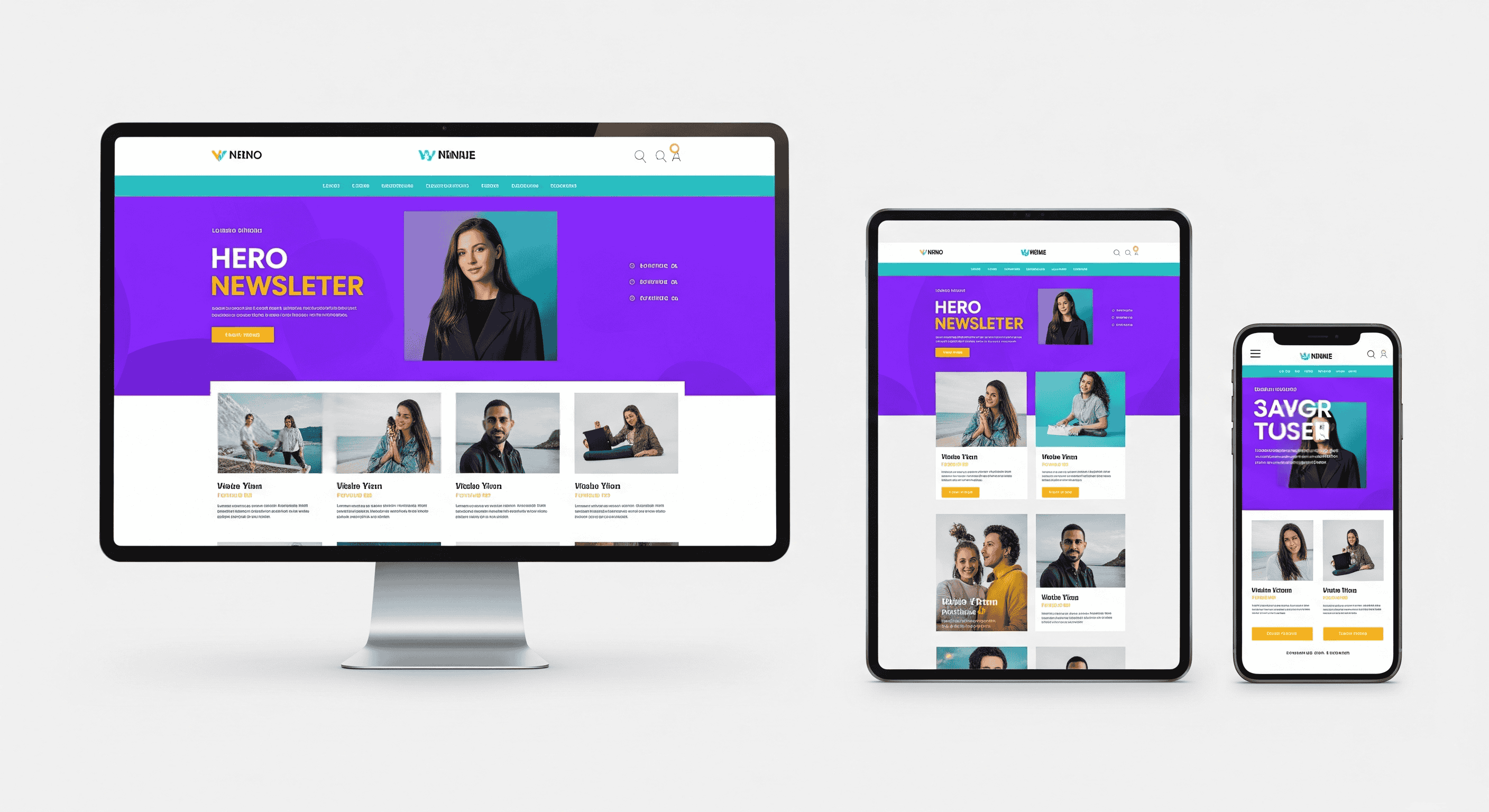
The Magic of Responsive Newsletter Design: Designing for Every Screen
Quick question: When you check your emails, are you at a desk or on your phone? Like most of us, you’re probably on your phone—maybe while sipping tea, riding the metro in Mumbai, or just chilling on the couch.
If your beautiful newsletter looks squished or broken on a phone, it gets deleted instantly. All your hard work, gone.
This is where the magic of responsive design comes in! It’s like giving your email a special superpower to shape-shift, automatically adjusting to look perfect on any screen size.
Here are some simple tips for mobile-friendly design:
- One Column is Your Best Friend: A single-column layout is a breeze to scroll through on a phone.
- Big, Friendly Buttons: Make your "Shop Now" buttons large and easy to tap with a finger.
- Text You Can Actually Read: Ensure your font size is large enough to be read comfortably on a small screen.
- Smart Pictures That Adjust: Use images that automatically resize themselves to fit any screen.
Telling Your Story Visually: Powerful Images, Videos & GIFs
Our brains just love pictures! Imagine trying to describe a delicious Rajasthani thali only with words. Seeing a photo makes your mouth water, right? That's the power of visual storytelling in newsletters.
Use visuals to:
- Grab Attention: Our eyes go straight to pictures first.
- Explain Quickly: A complex idea becomes clear with one good image.
- Create Feelings: Pictures can make people happy, excited, or inspired.
Best Practices for Your Newsletter's Visuals:
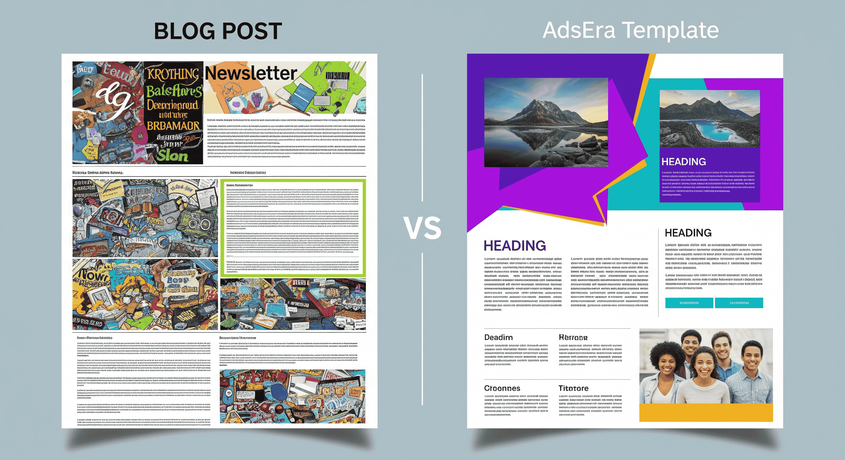
- Always Use High-Quality Pictures: Your images should be clear, sharp, and professional. No blurry photos!
- Make Sure Pictures Are Relevant: If you're talking about new product features, show that product!
- Keep Image File Sizes Small: Big picture files make your email slow to load, especially on mobile. Always optimize your images so they load super fast.
- Try Short GIFs for Fun: GIFs can add a touch of humor, show a quick product demo, or just make your email feel more lively.
- A Small, Important Tip: Use Alt Text! Always add "alt text" to your images. This short description helps people with vision problems, or when images don't load, understand what the picture is about. It makes your emails welcoming for everyone.
AdsEra Makes Design Simple & Effective (Even for Non-Designers!)
You might be thinking, "This all sounds great, but I'm no artist!"
This is where AdsEra steps in as your design superhero. We built AdsEra to give anyone the power to create professional, beautiful newsletter designs, even if you've never designed anything in your life.
- Drag-and-Drop Template Builder: Forget complicated code. With AdsEra's builder, designing is like playing with building blocks! You simply drag elements like text boxes, images, and buttons exactly where you want them.
- Beautiful, Pre-Designed Templates: Not sure where to start? AdsEra has a library full of professional,
pre-designed templatesthat already follow all the best design practices. Just pick one you love and add your content. - Mobile Preview: With AdsEra's
mobile preview feature, you can see exactly how your email will look on a phone before you hit send. No more guessing! - Built-in Image Optimization: Don't worry about slow-loading images. AdsEra helps handle the tricky part of image optimization behind the scenes, so your emails load super fast for everyone.
With AdsEra, creating newsletters that look amazing and work hard for your business is no longer a dream.
Explore AdsEra's Easy-to-Use Template Builder
Creative Newsletter Design Ideas in Action
You've got the secret ingredients. Now, let's look at some "recipes"—real-world newsletter layout ideas that bring these principles to life.
Idea 1: The "Clean & Focused" Layout (The Laser Beam!)
- The Vibe: Minimal text, one strong image, and a single, bold call-to-action button.
- When to Use It: Perfect for flash sale announcements, highlighting one new product, or urgent offers.
- Why It Works: There’s no clutter. Your main message literally pops, making it impossible for your reader to miss what's important.
Idea 2: The "Storyteller" Layout (The Journey!)
- The Vibe: Weaves together shorter blocks of text with compelling images, guiding the eye downwards through a narrative.
- When to Use It: Fantastic for sharing your brand's story, providing educational content, or explaining a complex topic step-by-step.
- Why It Works: People love stories! This layout builds deep engagement and keeps readers hooked for longer.
Idea 3: The "Product Showcase" Layout (The Shopping Spree!)
- The Vibe: Features clear, high-quality product images in neat grids. Each image has a short description and a direct "Shop Now" button.
- When to Use It: The ultimate layout for e-commerce businesses highlighting new arrivals or a seasonal collection.
- Why It Works: It combines enticing visuals with clear calls to action, making the Browse and buying experience super easy and tempting.
Conclusion: Design Your Way to Better Engagement
You've now seen that creative newsletter design is far more than just making things look pretty. It's a smart tool for connecting with your audience, making your messages crystal clear, and helping your business grow. You're not just sending emails; you're crafting experiences.
Don't be shy—experiment with these email newsletter design best practices and see what makes your audience click and smile.
Ready to bring your creative design ideas to life?